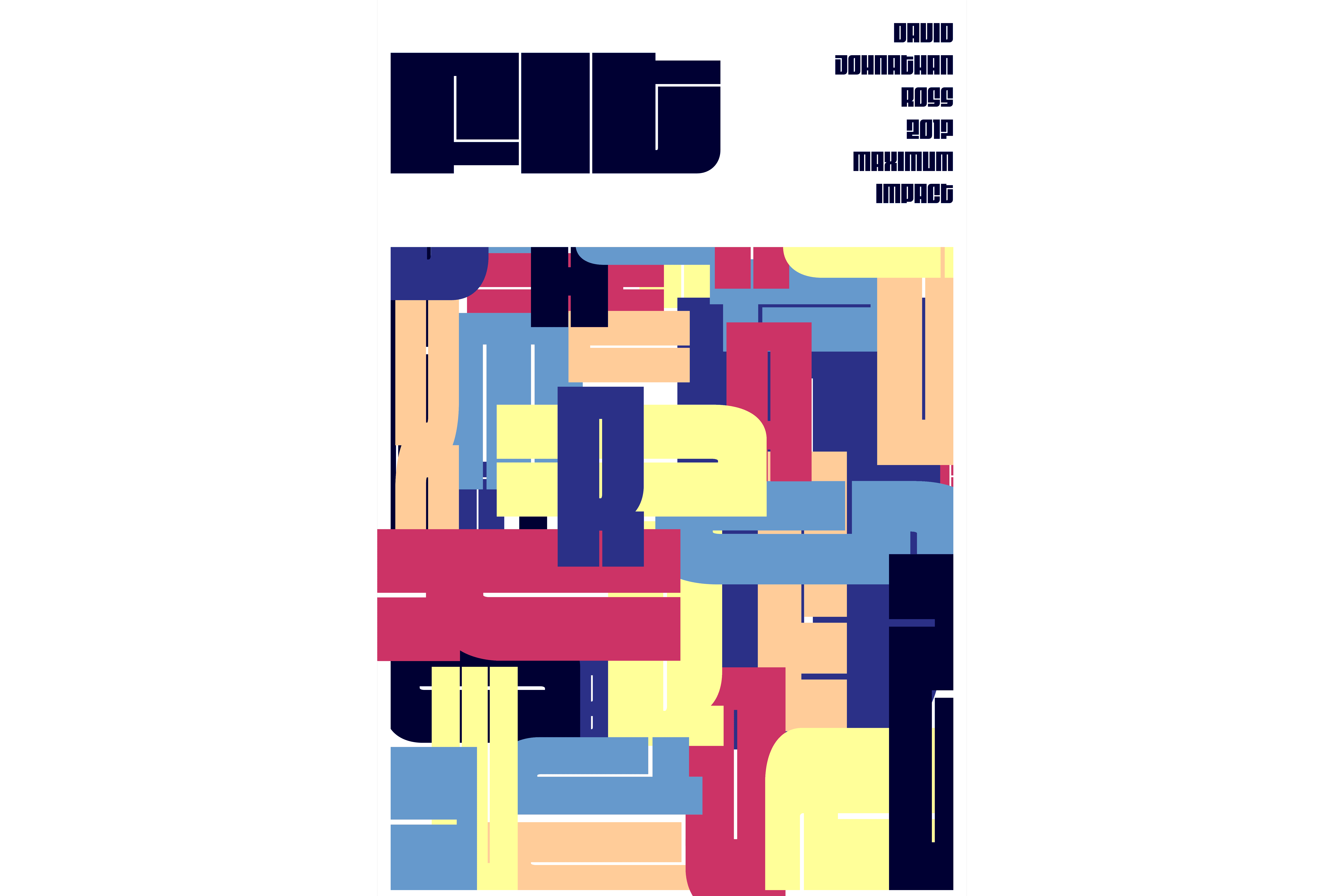
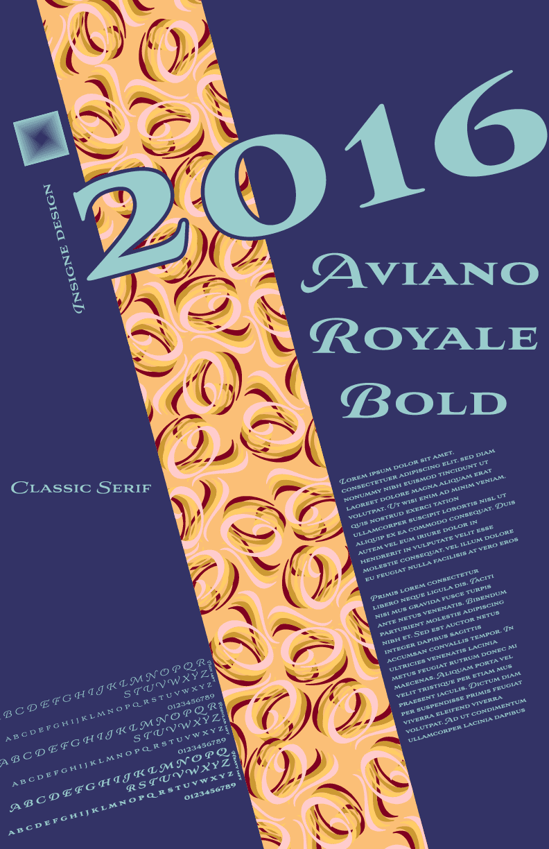
A bold typography poster that bursts with vibrant colors and playful design elements, combining quirky letterforms and "blurred" layout guides to create a lively, energetic visual statement.
Category:
Poster Design
Poster Design
My Process
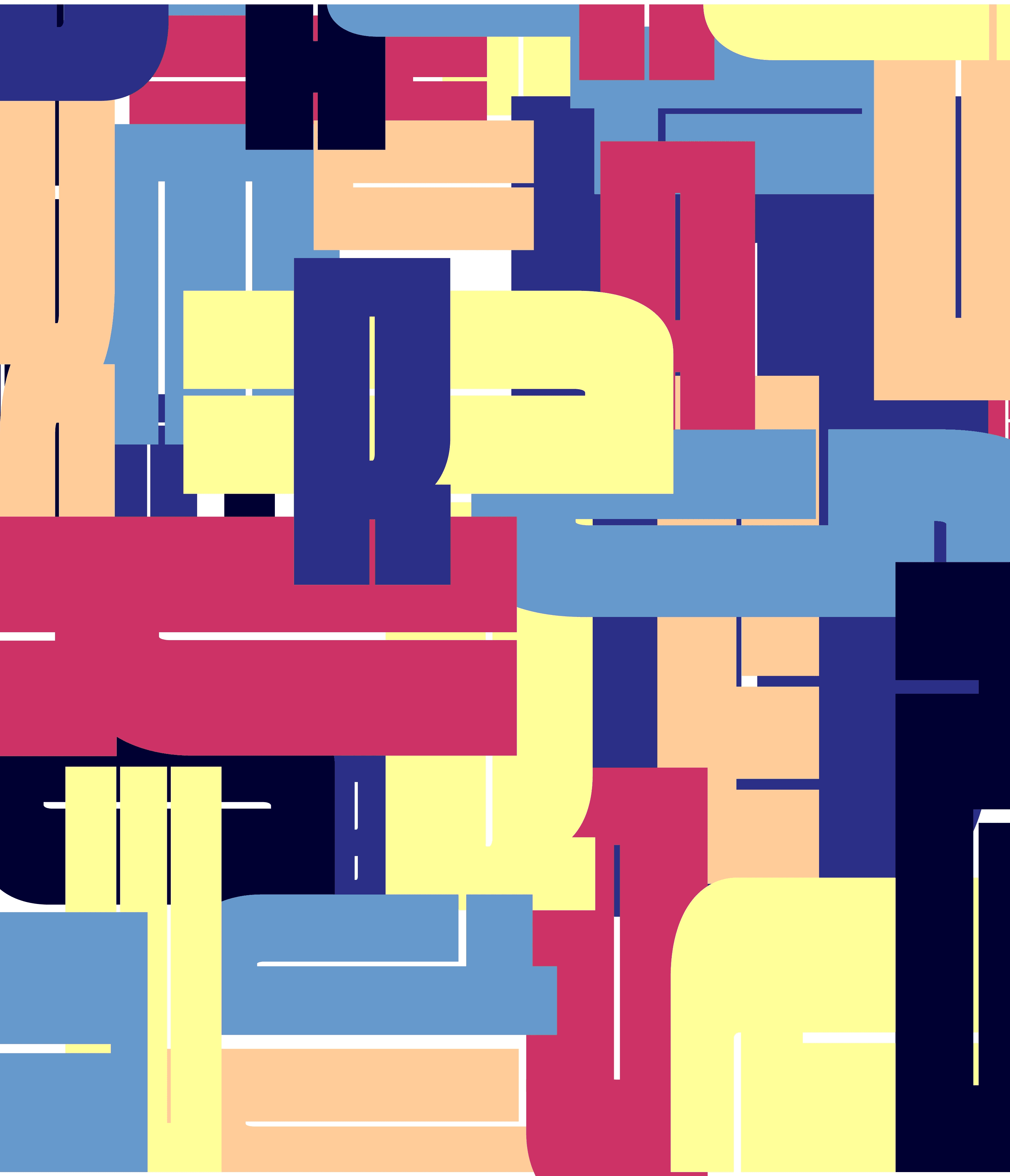
This type specimen poster was designed with a postmodern style to produce a vibrant composition that pops off the page. The font exhibited on this poster is called Fit. It is a very heavy font with one goal in mind, taking up as much space as possible. after researching the process and goals of this font, I designed a poster to promote this font's ability to fill space and fit into any crevasse.
The minimalist top third of the poster provides the important information about the font itself and helps to balance the negative space in contrast to the vibrant glyph below. The colors of the glyph agreement to glow on the page. With postmodern design's tendency to bend the guides and break rules, I purposefully made it so some of the letterforms in the glyph didn't fit. this subtle design choice gives the glyph a playful nature and complements to postmodern design style.